

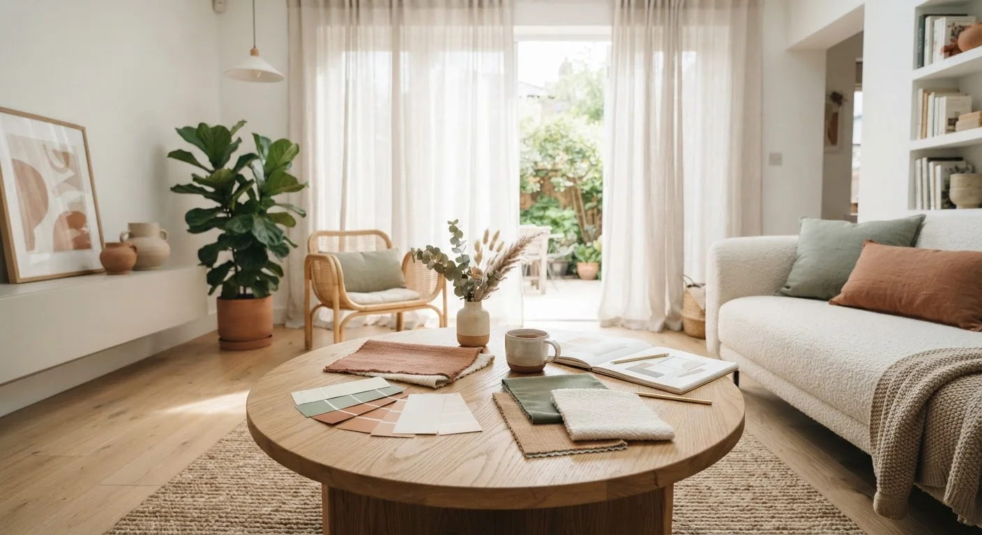
Key Takeaways
- You only need three to four colours to build a cohesive, intentional room palette.
- The colour wheel reveals simple relationships — complementary, analogous, triadic — that make colour decisions feel logical.
- Tint, shade, and tone are distinct concepts; understanding them prevents costly decorating mistakes.
- Lighting transforms how any colour reads on a wall or surface — always test swatches in your actual space.
- Starting small — with a throw, rug, or cushions — lets you explore colour without full commitment.
Start here
Why Colour Feels So Overwhelming (and Why It Doesn't Have to Be)
Build your foundation
The Colour Wheel: Your Actual Starting Point
Refine your vocabulary
Tone, Shade, and Tint: The Words That Clear Everything Up
Apply it
How to Build a Room Palette From Scratch
Troubleshoot
The Light Factor: Why Your Colour Looks Different at Home
Take action
Practical First Steps for the Colour-Hesitant
Why Colour Feels So Overwhelming (and Why It Doesn't Have to Be)
Most people who find decorating intimidating aren't actually afraid of colour — they're afraid of getting it wrong in a way that's expensive or permanent. Paint a room the wrong shade and you're living with it for months. Buy the wrong sofa and it anchors the whole room in a direction you didn't intend.
That fear is rational. But it often stems from a lack of a simple framework, not a lack of taste. The good news: colour theory gives you exactly that framework. It's not a design school subject reserved for professionals. It's a set of relationships between colours that follow predictable patterns — and once you see those patterns, choosing colours starts to feel logical rather than arbitrary.
The same instincts you use when putting an outfit together apply here, too. If you've ever noticed that a rust orange scarf pulls out the warmth in a navy coat, you already understand complementary contrast. For a closer look at how those same relationships work across your wardrobe, see the colour logic behind outfits that always look pulled together.
The Colour Wheel: Your Actual Starting Point
The colour wheel is simply a circular arrangement of colours showing how they relate to one another. Three concepts from it are most useful for home decorating:
- Complementary colours sit directly opposite each other on the wheel — blue and orange, purple and yellow. They create high contrast and visual energy. A room using complementary colours feels dynamic but requires careful balancing so it doesn't become jarring.
- Analogous colours are neighbours on the wheel — soft green, sage, and muted teal, for example. They create calm, cohesive spaces and are forgiving for beginners because the colours naturally flow into one another.
- Triadic colours are evenly spaced around the wheel — think terracotta, dusty teal, and pale gold. Used thoughtfully, they add vibrancy without clashing.
You don't need to memorise all of these. Choosing one relationship as your starting point gives you a filter for every subsequent decision in a room.
Hue
The pure form of a colour as it appears on the colour wheel, before any white, black, or grey is added. Red, blue, and yellow are hues.
Complementary colours
Two colours that sit directly opposite each other on the colour wheel. When placed together, they create high visual contrast and make each other appear more vivid.
Analogous colours
A group of colours that sit adjacent to one another on the colour wheel, such as blue, blue-green, and green. They naturally harmonise and are easy to combine.
Saturation
How intense or vivid a colour is. A highly saturated colour is bold and bright; a low-saturation version of the same colour appears muted or greyed-down.
Colour temperature
The perceived warmth or coolness of a colour or light source. Reds, oranges, and yellows are considered warm; blues and greens are considered cool.
Undertone
A subtle secondary colour present within a dominant colour. A white wall paint might have a pink, yellow, or blue undertone that only becomes visible next to other colours or under certain light.
Tone, Shade, and Tint: The Words That Clear Everything Up
Three terms get used interchangeably in decorating conversations, but they mean distinct things — and mixing them up leads to mismatched results.
- Tint
- A colour mixed with white. Blush pink is a tint of red. Tints feel lighter, softer, and more airy.
- Shade
- A colour mixed with black. Burgundy is a shade of red. Shades feel richer, moodier, and more grounded.
- Tone
- A colour mixed with grey. Dusty rose is a tone of red. Tones feel sophisticated and muted — they're the backbone of most contemporary interiors.
Understanding these distinctions explains why two greens that seem similar in a store can look completely different on a wall. One might be a tint (pale, bright), the other a tone (soft, greyed-down). Knowing what you're actually looking at saves time and money.
How to Build a Room Palette From Scratch
A reliable starting approach is the 60-30-10 split: 60% dominant colour (walls, large furniture), 30% secondary colour (rugs, curtains, upholstery), and 10% accent colour (cushions, small decor, artwork). This isn't a rigid formula, but it gives you a structure that prevents one colour from overwhelming or disappearing entirely.
Start with what you already own. If your sofa is a warm camel, that's your dominant tone — now find colours that flatter it rather than fight it. Analogous tones like rust, cream, or olive will create ease. A deep teal used sparingly will add contrast without chaos.
Use a Favourite Object as Your Palette Anchor
Before choosing any paint or fabric, find one object in your home — a piece of art, a ceramic vase, a textile — whose colours genuinely delight you. Use it as your reference point: pull two or three colours from it and let those guide your room choices. This grounds abstract decisions in something concrete and personal.
For those drawn to neutral foundations — and there are excellent reasons to start there — the Home & Space hub offers a range of guides on building spaces that feel both personal and functional. And for a balanced look at how neutrals operate as a canvas rather than a cop-out, the article on neutral colours as a wardrobe foundation translates well to interior thinking too.
The Light Factor: Why Your Colour Looks Different at Home
Lighting is the single most underestimated variable in home colour decisions. The same paint chip will look completely different in a south-facing room flooded with warm afternoon light versus a north-facing room with cool, indirect daylight. Artificial lighting adds another layer — warm-toned bulbs shift colours toward yellow and amber, while cool-toned bulbs pull them toward blue and grey.
This is why testing is non-negotiable. Paint a large swatch (at least A4 size) directly on your wall and observe it at different times of day and under your actual lighting. What looks like a serene sage at noon may read as a dingy khaki by lamplight.
For a full explanation of how light temperature works and what to look for when choosing bulbs and fixtures, natural light, lamps, and colour temperature is a useful plain-language primer. And if you've encountered sweeping claims about colour psychology in rooms — blue makes you calm, yellow makes you anxious — it's worth reading what the research actually says about colour in rooms before taking those rules too literally.
Practical First Steps for the Colour-Hesitant
You don't have to repaint a room to experiment with colour. Textiles are the lowest-stakes entry point: a new rug, a set of cushions, or a throw introduces colour you can return, swap, or store. Start there. Notice what you're drawn to and what feels uncomfortable — both responses are useful information.
When you're ready to go further, pull inspiration from something you already love: a piece of art, a scarf, a ceramic bowl. Real palettes almost always start with an object, not an abstract scheme. Identify the two or three colours in it, then use those as the anchors for your room's palette.
The same principles that guide a well-considered wardrobe guide a well-considered room. If you want to deepen your understanding of how colour works as a personal language — across both your home and how you dress — the role of colour in defining how you dress offers a thoughtful place to continue.
Colour confidence in a home doesn't arrive all at once. It accumulates through small, deliberate choices — and every good choice teaches you something the next one benefits from.