

Key Takeaways
- Most pulled-together outfits rely on just two or three colour relationships, not complex matching.
- Neutrals anchor any palette and make bold colours easier to wear without looking overdone.
- Tonal dressing — varying shades of one colour — is one of the simplest high-impact techniques.
- Colour proportion matters: a single accent colour reads as intentional; several compete for attention.
- Understanding undertones helps you combine colours that feel harmonious rather than clashing.
Colour Logic in Dressing
Colour logic refers to the predictable relationships between colours — such as contrast, harmony, and proportion — that determine whether an outfit reads as cohesive or chaotic. Understanding a handful of these relationships allows you to assemble outfits that look deliberate without relying on instinct or luck. It is not about following seasonal palettes; it is about knowing which colour combinations reliably work and why.
Colour logic draws on principles from colour theory — specifically hue relationships on the traditional colour wheel — but applies them practically to garment selection and outfit assembly.
Why Some Outfits Just Work
There is a particular kind of outfit that earns consistent compliments — not because it features anything expensive or trend-forward, but because it looks considered. The colours sit together comfortably. Nothing fights for attention. It projects an ease that reads as effort, even when it took five minutes.
That quality is rarely accidental. It comes from a handful of predictable colour relationships that stylists and fashion editors return to again and again. Understanding them removes the guesswork from getting dressed and replaces it with a reliable mental framework you can apply to whatever is already in your wardrobe. As the personal style tips approach makes clear, confidence in dressing comes from principles, not prescriptions.
The Three Relationships That Do Most of the Work
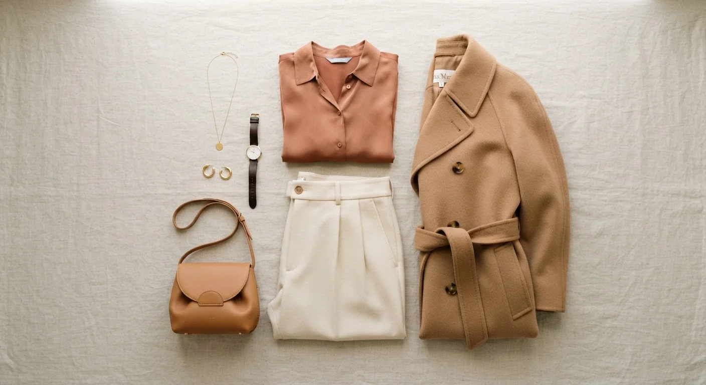
1. Tonal harmony is the practice of combining varying shades or tints of a single colour family. Navy with powder blue and slate, or camel with cream and warm chocolate — these combinations feel inherently cohesive because the eye reads continuity rather than contrast. Tonal outfits also photograph well and carry across occasions without effort.
2. Neutral anchoring involves grounding any colour with a true neutral — black, white, grey, camel, or navy — that allows the non-neutral to read as intentional rather than loud. A single strong colour paired with a neutral lets the colour shine without overwhelming. This is why a cobalt blue shirt feels different paired with tailored grey trousers than it does paired with printed trousers: the neutral gives the eye somewhere to rest.
3. Considered contrast uses colours from opposite sides of the colour wheel — warm against cool, or light against dark — to create visual energy without chaos. The key word is considered: one point of contrast reads as deliberate; multiple competing contrasts read as busy. Texture and pattern follow a similar logic — contrast is most effective when it is singular and purposeful.
Test Your Palette Before Getting Dressed
When trying a new colour combination, lay the pieces flat together before putting them on. Without your body as a variable, it is easier to see whether the colours sit comfortably or create visual tension. This simple step takes thirty seconds and saves the frustration of second-guessing an outfit mid-morning.
Undertones: The Hidden Variable
Undertone is the subtle warm or cool quality beneath a colour's surface. Two navy pieces can look mismatched if one reads slightly purple-cool and the other reads blue-warm. Undertone conflict is the most common reason an outfit assembled from seemingly compatible colours still feels slightly off.
Practically speaking, grouping warm-undertoned pieces together — ochre, camel, rust, warm white — and cool-undertoned pieces together — slate, cobalt, cool taupe, bright white — produces more natural harmony. You do not need to analyse every purchase; simply noting whether a piece feels warm or cool is enough to make better pairing decisions at a glance.
Undertone Awareness Takes Practice
You do not need to be a colour expert to develop undertone awareness — it builds gradually through observation. Holding pieces next to each other in natural light, rather than artificial indoor lighting, makes undertone differences significantly easier to detect. Over time, recognising warm versus cool becomes instinctive rather than analytical.
Proportion: How Much Colour Is Too Much
Colour proportion is as important as colour selection. A standard framework used in interior and fashion styling is an approximate 60-30-10 distribution: a dominant neutral or base colour occupying the largest visual area, a secondary colour taking up roughly a third, and an accent colour appearing sparingly. The exact percentages matter less than the principle — one colour should clearly lead, while others support.
When colours are given equal visual weight, the outfit loses hierarchy and can feel unsettled. This is why a bold print that combines several colours works best when anchored by a single-colour companion piece: it provides the dominant anchor the print cannot supply for itself. For a deeper look at how colour interacts with other design elements, texture, pattern, and silhouette each play a supporting role.
Building a Colour-Logical Wardrobe
The easiest way to apply colour logic systemically is to build around a cohesive palette rather than assembling pieces in isolation. When your neutrals, your accent colours, and your core pieces all share undertone territory, almost everything will work together by default — which is the foundation of true wardrobe versatility.
Start by identifying the two or three neutrals that appear most often in pieces you already reach for. Then note which accent colours feel most natural alongside them. That cluster is your working palette. New pieces that sit within it will integrate immediately; those outside it require more intentional pairing. Our guide to building around neutrals explores this foundation in detail, and outfit formulas show exactly how to translate palette into daily dressing.