
Colour in Rooms: What the Research Says vs. What Decorating Advice Oversimplifies

Key Takeaways
- Colour psychology in rooms is real but highly context-dependent — no single hue universally calms or energises.
- Individual associations, lighting, and saturation level matter far more than generalised colour rules.
- Cultural background significantly shapes how people interpret and respond to specific colours.
- Paint colour alone rarely transforms how a room feels — texture, light, and proportion do equal or greater work.
- Using colour intentionally is less about rules and more about understanding your own responses and living patterns.
Why Colour Advice Tends to Overpromise
Walk into any home décor section — or scroll through design content online — and you'll encounter versions of the same confident claims: blue bedrooms improve sleep, red kitchens stimulate appetite, yellow hallways boost energy. These statements move through decorating culture as though they're settled science. They aren't.
The field of environmental colour psychology is legitimate and actively researched, but its findings are considerably messier than popular accounts let on. Colour perception is shaped by saturation, brightness, and lightness as much as hue; by the quality and direction of light hitting a surface; and by each person's individual associations and cultural background. A shade that reads as calming in one room or for one person can register as cold or clinical in another context. For a fuller look at how light and colour interact in practice, see how lighting fundamentally changes a room's mood.
The myths below reflect where popular decorating advice has flattened a nuanced body of research into rules it cannot actually support.
Myth
Blue is a universally calming colour and is the best choice for bedrooms.
Fact
Blue can feel calming for many people, but the effect depends heavily on the specific tone, saturation, and how much natural light a room receives.
The idea that blue universally promotes relaxation is one of the most repeated claims in decorating advice, often attributed loosely to colour psychology research. But studies in environmental psychology consistently show that the calming or activating effect of a colour is driven more by its lightness and saturation than its hue alone. A highly saturated, electric blue can feel stimulating or even agitating, while a muted slate or dusty teal might genuinely feel restful. Context — including the size of the room, ceiling height, and available light — further modifies the perception. Individual and cultural associations with colour also play a significant role that blanket rules erase entirely.
Myth
Warm colours like red and orange make a room feel smaller.
Fact
Perceived room size is influenced by a combination of factors including value (lightness/darkness), saturation, and the proportion of walls covered — not hue alone.
The notion that warm colours uniformly advance (making walls feel closer) while cool colours recede is a real principle in colour theory — but it's far weaker in practice than it sounds on paper. Research on spatial perception in interior environments has found that the lightness of a colour is a stronger predictor of perceived spaciousness than its warm or cool classification. A light, low-saturation terracotta will often feel more open than a dark, saturated navy. The rule oversimplifies a genuine phenomenon and has led many people to avoid warm tones in smaller rooms unnecessarily.
Myth
Painting a room green is proven to reduce stress.
Fact
Some research associates green environments with restoration, but the effect is inconsistently replicated and appears tied to associations with nature, not the colour green itself.
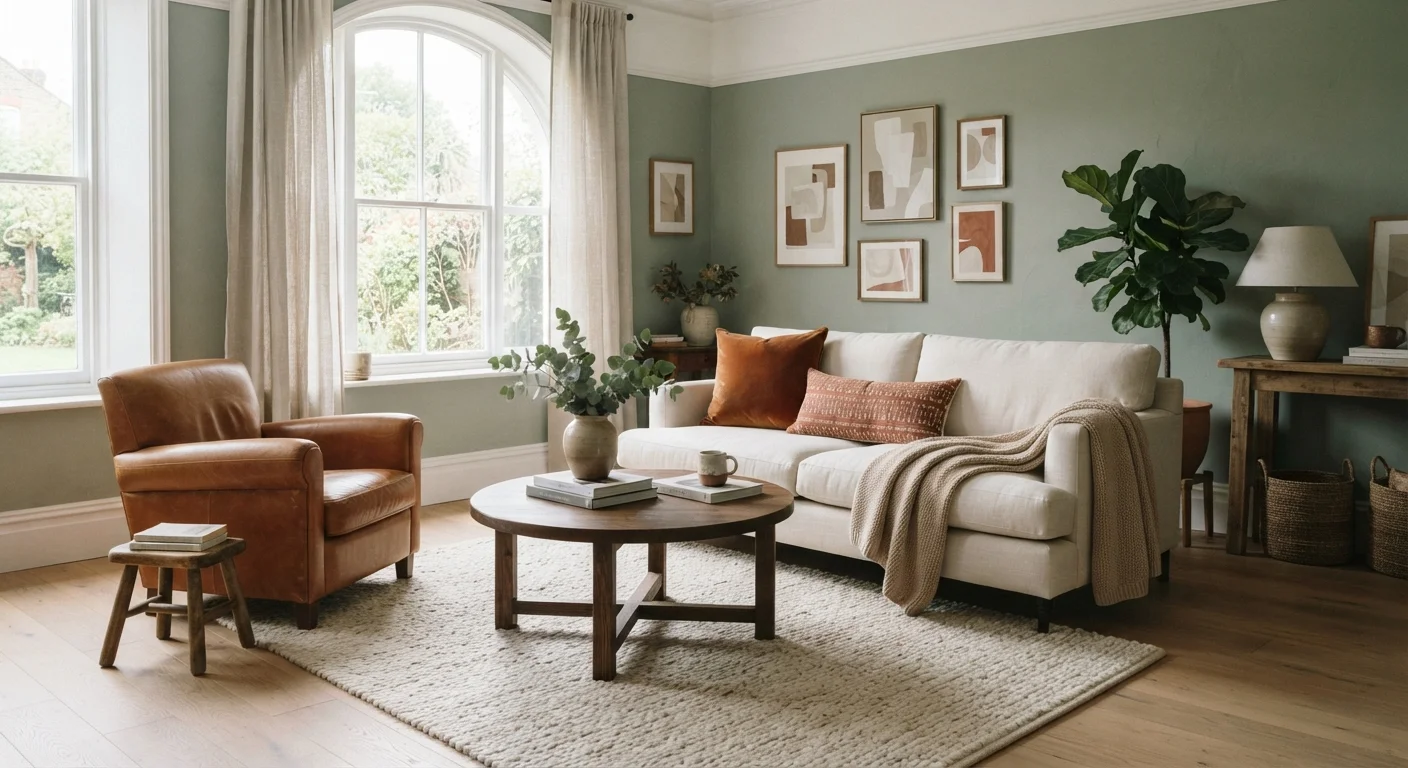
There is legitimate research — much of it under the broader umbrella of biophilic design — suggesting that natural environments and greenery can support psychological restoration. However, the leap from "nature is restorative" to "paint your walls green and reduce stress" is not well supported. Studies on interior colour and stress outcomes tend to be small, use different methodologies, and often fail to replicate cleanly. Where positive effects appear, they're typically linked to muted, natural-looking greens rather than bright or saturated versions, and may be partly driven by expectations rather than pure perceptual response. Green paint without other natural elements — texture, plants, natural materials — is unlikely to produce meaningful stress relief on its own.
Myth
White rooms feel larger and are easier to decorate around.
Fact
White reflects more light but can read as stark, cold, or flat depending on undertones and room conditions — and it doesn't simplify decorating as reliably as assumed.
White is often recommended as a neutral default that makes spaces feel bigger and provides a blank canvas. The light-reflection benefit is real: high-reflectance whites do increase perceived brightness in well-lit rooms. But white is not a single colour — it contains undertones (warm, cool, green-leaning, purple-leaning) that interact unpredictably with specific light sources and furnishings. A white that reads as crisp and clean in a north-facing room with cool daylight can look greenish or blue-grey under artificial warm light. "Decorating around white" also proves harder than expected because white backgrounds make every object and colour choice more visually exposed, not less. Many people find that off-whites and warm whites are more liveable without sacrificing the light-maximising benefit.
Myth
You should match your wall colour to your mood goals for that room.
Fact
Mood is influenced by far more than wall colour — and optimising colour for a single intended mood often ignores how a room is actually used across different times and activities.
The advice to choose paint based on how you want to feel in a room sounds logical, but it assumes mood is a fixed target and that colour is the primary driver — neither of which holds up. Most rooms serve multiple purposes and are used at different times of day under different lighting conditions. A bedroom might need to support alertness in the morning and rest at night. A home office might need to feel energising during work hours but tolerable on weekends. Beyond that, a room's mood is determined at least as much by its furniture arrangement, clutter level, natural light access, and the textural qualities of surfaces as by paint colour. Focusing narrowly on hue while ignoring these other variables reliably produces results that feel off. For parallel thinking applied to personal style, how colour shapes mood in what you wear offers useful context.
What Good Colour Decision-Making Actually Looks Like
Understanding the limits of generalised colour rules isn't a reason to abandon intentional colour choices — it's a reason to make more honest ones. The most useful framework isn't "which colour does what" but rather: how does this specific tone, at this saturation, in this light, align with how I actually use this room?
Highly saturated colours — regardless of hue — tend to feel visually demanding over time. Muted, lower-saturation versions of the same colours are often easier to live with long-term without being visually inert. Warm neutrals and earth tones have performed well in habitability research not because they're inherently soothing, but because they're forgiving across different light conditions and tend to pair with a wide range of furnishings.
~30%
Variance in colour perception explained by individual differences
Research in colour psychology suggests individual variation — including personal associations and past experiences — accounts for a substantial portion of how people respond to the same colour in the same space.
2–3x
Impact of saturation vs. hue on perceived comfort
Studies on interior environments consistently find that a colour's saturation level has a stronger effect on occupant comfort ratings than the specific hue, challenging advice focused primarily on colour families.
If you find colour selection overwhelming, a structured approach to the basics can reduce the trial-and-error significantly — colour theory for people who find decorating intimidating breaks down the concepts in practical, jargon-free terms. And for broader thinking about how the feeling of a room comes together — beyond paint alone — what makes rooms feel calm and lived-in is worth reading alongside this piece.
Colour is one lever among many. Treating it as the primary determinant of how a space feels will consistently lead to disappointment. Treating it as one thoughtful, adjustable element within a whole — that approach has a much better track record.