

Key Takeaways
- Colour communicates mood and intention before you say a word — making it one of the most powerful tools in personal style.
- A personal colour story is built from your own emotional responses to colour, not from trend cycles or rule-based systems.
- Understanding your skin undertone can help you identify which colours sit harmoniously near your face.
- Neutrals and accent colours each play distinct structural roles within a cohesive wardrobe palette.
- Consistency in colour — not sameness — is what makes a wardrobe feel effortlessly pulled together.
Personal Colour Story
A personal colour story is the intentional, recurring set of colours that anchors your wardrobe and reflects how you want to feel and be perceived. Rather than chasing seasonal palettes, it's a self-curated range that remains consistent across seasons and occasions. Think of it as the colour equivalent of a signature — recognisable, purposeful, and genuinely yours.
Colour story differs from formal systems like seasonal colour analysis (e.g. 'Autumn,' 'Cool Winter') in that it prioritises self-expression and lifestyle fit over complexion-matching formulas alone.
Why Colour Is the First Language of Style
Before silhouette registers, before fabric quality is noticed, colour lands. It's the fastest signal your wardrobe sends — communicating energy, intention, and emotional tone in a fraction of a second. That's not poetic licence; it reflects how visual perception actually works. Colour is processed pre-consciously, which is why what you wear can shape the mood of a room before you've introduced yourself.
For women navigating a relentless cycle of trend messaging, this is worth sitting with. Colour decisions are rarely neutral. Reaching instinctively for deep navy on a day you want to feel grounded, or a warm rust-red when you're feeling expressive, isn't accidental — it's your personal colour intelligence at work. The goal isn't to override that instinct with colour theory rules, but to understand it well enough to use it deliberately.
“Colour is a power which directly influences the soul. Colour is the keyboard, the eyes are the hammers, and the soul is the piano with many strings.”
— Wassily Kandinsky, Artist and author of 'Concerning the Spiritual in Art'
Building a Personal Colour Story (Not a Season-Based Formula)
Trend-led colour advice has a short shelf life by design. A personal colour story, by contrast, is built to last. It begins with honest observation: which colours do you consistently wear, feel good in, and return to regardless of what's in stores? Those colours are your evidence base.
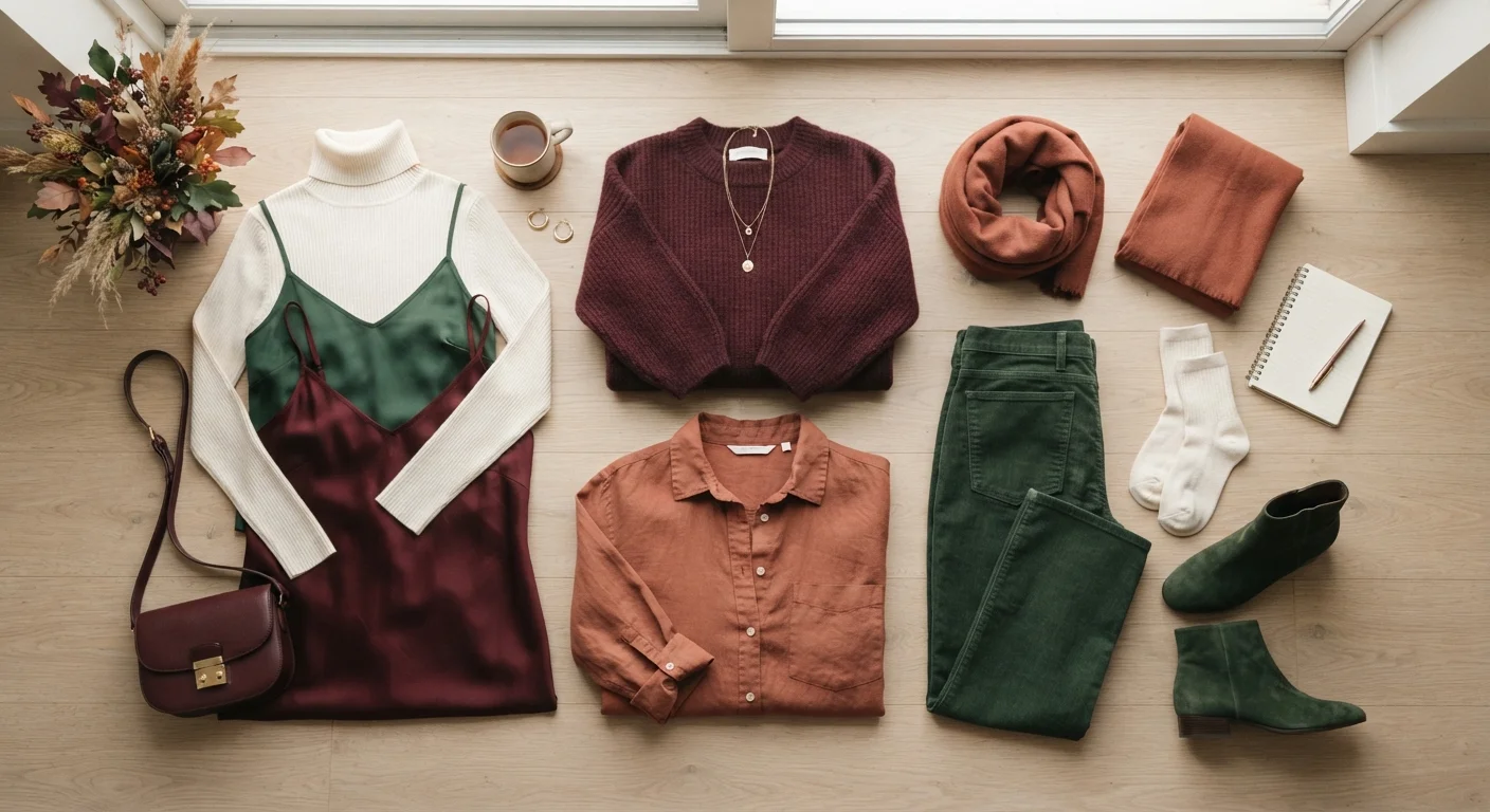
From there, most wardrobe palettes function across three tiers. Foundation colours — often neutrals like warm stone, charcoal, ivory, or navy — carry the structural load and appear most frequently. Mid-tone anchors add personality without overwhelming: a dusty olive, a muted burgundy, a soft slate. Accent colours show up in smaller doses — a scarf, a shoe, a single statement piece — and give a wardrobe its edge. The role neutrals play as a wardrobe foundation is often misread as conservative; in practice, a strong neutral base makes bold accent colours more impactful, not less.
62–90%
First impression influenced by colour alone
Research cited in the Institute for Color Research suggests colour accounts for a significant share of snap judgements in social and commercial contexts, though exact figures vary by study design.
3–5
Core colours in a functional wardrobe palette
Wardrobe strategists widely recommend anchoring a wardrobe in three to five core colours to maximise outfit combinations and reduce decision fatigue.
The process isn't about restriction — it's about reducing the cognitive load of getting dressed while increasing how consistently intentional your outfits feel. For a deeper look at how colour relationships create cohesion, see the colour logic behind outfits that always look pulled together.
Skin Undertone as a Starting Point — Not a Rule
Undertone — whether your skin reads warm (golden, peachy, olive), cool (pink, red, bluish), or neutral — is one of the most practical tools for narrowing your colour story. Colours that share your undertone tend to sit harmoniously near your face, making skin look more even and alive. Those that clash can create a grey or washed-out effect, not because the colour is wrong, but because the contrast works against your natural tone rather than with it.
This isn't a hard boundary, though. Undertone guidance is a useful starting point for anyone who finds colour selection overwhelming — not a ceiling. If a colour energises you emotionally and you love how you feel wearing it, placement matters: wearing a challenging colour at the waist or below the knee rather than near the face can resolve a lot of undertone tension without abandoning the colour entirely. For a thorough breakdown of how undertone identification works, skin undertones explained is a useful companion read.
Colour as Self-Expression, Not Self-Correction
One of the most persistent problems with conventional colour advice is that it frames colour as something to get right — a tool for correcting, flattering, or managing the body. This is a narrow and ultimately limiting view. Colour is, at its most powerful, a form of self-expression: a way of communicating who you are, what you're drawn to, and how you want to move through the world.
That shift in framing matters. It moves colour from the realm of rules into the realm of identity. A woman who wears consistent shades of terracotta, ivory, and tobacco brown isn't following a formula — she's speaking a visual language that's become recognisable as hers. This is the difference between dressing to pass and dressing to be seen. Style decisions rooted in self-expression, rather than proportion correction or trend compliance, are explored further in dressing for body proportions vs. personal expression.
Colour also doesn't operate in isolation. Once you've established your palette, the next layer is understanding how texture, pattern, and silhouette interact with it — an area that texture, pattern, and silhouette as building blocks addresses directly.
Audit Before You Add
Before buying anything new, spend ten minutes pulling every piece of clothing you actually wear regularly. Lay them out and look for the colours that appear more than twice — those are your natural palette anchors. This audit is more useful than any colour quiz for identifying your genuine preferences, because it reflects real choices made over time, not aspirational ones.