

Key Takeaways
- Choosing furniture scaled to the room's footprint prevents visual clutter and preserves floor space.
- Light, a well-placed mirror, and a restrained color palette are the most powerful tools for expanding a small room visually.
- Vertical storage draws the eye upward and makes ceilings feel taller without taking up floor area.
- Layering textures thoughtfully adds warmth and personality without adding physical bulk.
- Editing your objects — keeping only what you love and use — is as important as any design decision.
What you will need
Why Small Living Rooms Deserve Intentional Design
A compact living room is one of the most common design challenges — and one of the most solvable. The instinct is often to push everything against the walls or pack in more storage, but those moves frequently make a room feel smaller, not larger. What actually works is a more considered approach: understanding how the eye moves through a space, where natural light lands, and which design decisions create the illusion of breathing room.
The principles behind a generous-feeling small room are less about square footage and more about proportion, restraint, and layering. Whether you're renting or own your home, many of these changes require no permanent alterations — just a willingness to rethink what you've placed, and why. For renters navigating lease constraints, personalising a rented space is more possible than most assume.
What you will need
Step-by-Step: Styling a Small Living Room
Work through these steps in sequence — each decision builds on the one before it, so changes land with more impact when approached as a whole.
Measure first, then choose your anchor piece
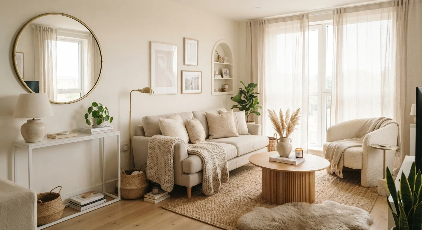
Before moving a single item, measure your room's usable floor area — accounting for doors, windows, and traffic paths. Your sofa or primary seating is the anchor piece everything else orbits. In a small room, this piece should leave at least 18 inches of clear walkway on each open side. A sofa that's even a foot too wide will crowd the room immediately. Opt for clean-lined silhouettes with exposed legs, which allow light to pass beneath and make the piece feel less solid on the floor.
Establish a restrained, cohesive color palette
A small room benefits from a palette of two or three tones that flow into one another rather than compete. Lighter walls — soft whites, warm creams, muted greiges — reflect available light and push boundaries outward visually. If you want depth or personality, introduce it through textiles and accessories rather than wall color, which is easier to adjust over time. A single deeper accent tone on cushions or a throw grounds the palette without closing the room in.
Position a large mirror strategically
A mirror is arguably the most effective single tool in a small-room toolkit. Hung opposite or adjacent to a window, it reflects natural light back into the room and creates the impression of an additional opening or passage. Size matters here: a large mirror (at least 24 by 36 inches) does significantly more work than a cluster of small ones. Lean it against a wall if you prefer a less permanent arrangement — the effect is nearly identical, and it works well in rented spaces.
Prioritise vertical storage
In a compact room, floor space is precious and wall height is underused. Tall bookshelves, floating shelves positioned near the ceiling line, and vertical cabinetry draw the eye upward and make ceilings feel higher. When styling open shelves, mix books with objects and leave some sections deliberately sparse — this prevents the shelving from reading as dense and overwhelming. How you approach open versus closed storage shapes both the visual weight and the practicality of the room significantly.
Layer texture, not volume
Warmth and personality in a small room come from layering textures — a woven throw, a linen cushion, a jute rug — rather than accumulating more objects or larger pieces. Texture catches light differently across the day and creates visual interest without adding bulk. Keep silhouettes simple and let material variation do the work. This approach is central to designing a room that feels calm and genuinely lived-in.
Edit ruthlessly and display with intention
The final step is the hardest and the most impactful. Walk through your styled room and remove anything that doesn't serve a clear purpose — functional, aesthetic, or emotional. In a small space, every visible object carries more visual weight than it would in a larger room. What remains should be intentional: a few objects you genuinely love, placed where they can be appreciated. This level of curation is what distinguishes a room that feels designed from one that simply feels full. For shared homes, navigating different needs within the same space adds an additional layer worth thinking through together.
Think in Zones, Not Zones
Even in a single small room, defining subtle zones — a seating area anchored by a rug, a reading corner marked by a floor lamp — gives the space purpose and structure. Defined zones prevent a room from feeling like one undifferentiated pile of furniture, and they make the room feel like it's doing more than one thing, which psychologically reads as larger.
Common Mistakes to Avoid
Even well-intentioned edits can backfire in small spaces. The most common misstep is choosing a rug that's too small — an undersized rug fragments the floor visually and makes the room feel more cluttered, not less. A rug that fits beneath the front legs of every major seat anchors the space without cutting it into pieces.
Another frequent error is relying solely on overhead lighting. A single ceiling fixture flattens a room and emphasises its boundaries. Floor lamps and table lamps at different heights create pools of light that invite the eye to move, which paradoxically makes a room feel larger and more dimensional. For a deeper look at how storage choices shape a room's visual weight, open shelving versus closed cabinets is worth reading before committing to either approach.
Avoid Matching Sets in Small Spaces
A perfectly matched furniture suite — sofa, loveseat, armchair, and coffee table all from the same collection — tends to read as heavy and monotonous in a compact room. Mixing scales and finishes within a cohesive palette creates more visual interest and lightness. Choose pieces that complement rather than replicate each other.
Finally, resist the urge to fill every surface. Negative space — the deliberate absence of objects — is itself a design element. The principles behind rooms that feel calm and lived-in often come down to knowing what to leave out as much as what to include.